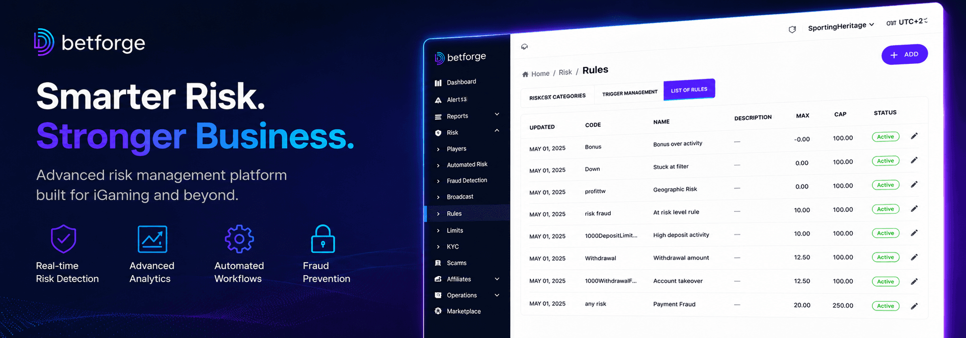
Why a single 'Edit' button sparked a fight over our B2B admin panel
We recently spent way too long arguing over a single 'Edit' button at BetForge.
The debate was standard product stuff: do we keep row actions visible at all times in our data tables, or hide them behind a hover state to keep the interface clean? Trivial, right? But it accidentally cracked open a much bigger issue. Why does the B2B iGaming industry treat back-office software like the ugly stepchild of the casino lobby?
The silent cost of ugly enterprise software
Think about it. Operators will pour massive budgets into flashy game lobbies, slick promotional banners, and pixel-perfect mobile UX. Yet the software their risk managers, CRM teams, and support agents are forced to stare at for eight hours a day? It usually looks like a spreadsheet from 2005.
This isn't just an aesthetic problem; it's an expensive one:
- It causes real mistakes. Cluttered interfaces directly lead to errors when operations are under pressure - think incorrect bonus triggers, missed withdrawal flags, or messing up a VIP's tier.
- It kills onboarding. If your admin panel requires a 50-page manual, scaling an ops team is painfully slow.
- It creates friction. If adjusting a player's deposit limit takes five clicks through deeply nested menus, your team will either find sketchy workarounds or just avoid doing it altogether.
What "consumer-grade" actually means for B2B
The people running your back-office use Spotify, Uber, and Airbnb in their downtime. Their baseline for how software should behave is set by top-tier consumer apps. When they clock in and switch to clunky enterprise tools, it feels like a punishment.
Bringing "consumer-grade" UX to B2B isn't about slapping on dark mode and some rounded corners. It’s strictly functional. It means showing operators only what they need to act on right now. It means using progressive disclosure - actions should appear when the user actually signals intent, rather than screaming for attention all at once.
It’s also about feedback. A button that responds instantly or a status change that animates smoothly reduces the cognitive load of wondering, "Did that actually save?" If that logic holds up across the entire admin panel, training becomes intuitive rather than an exercise in rote memorization.
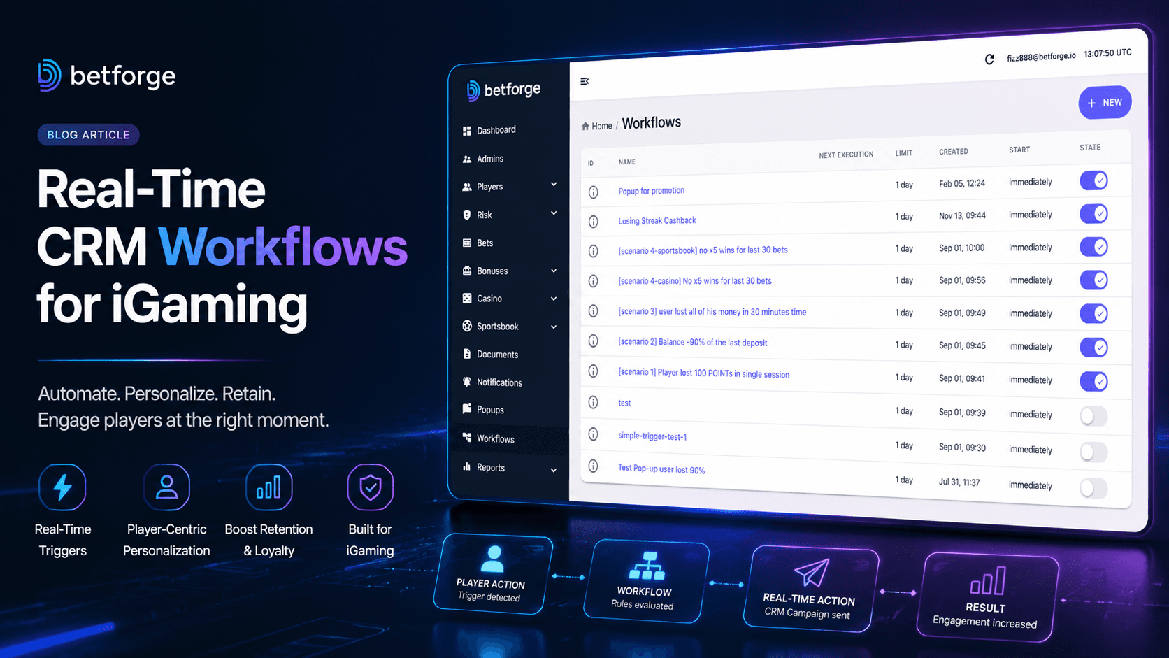
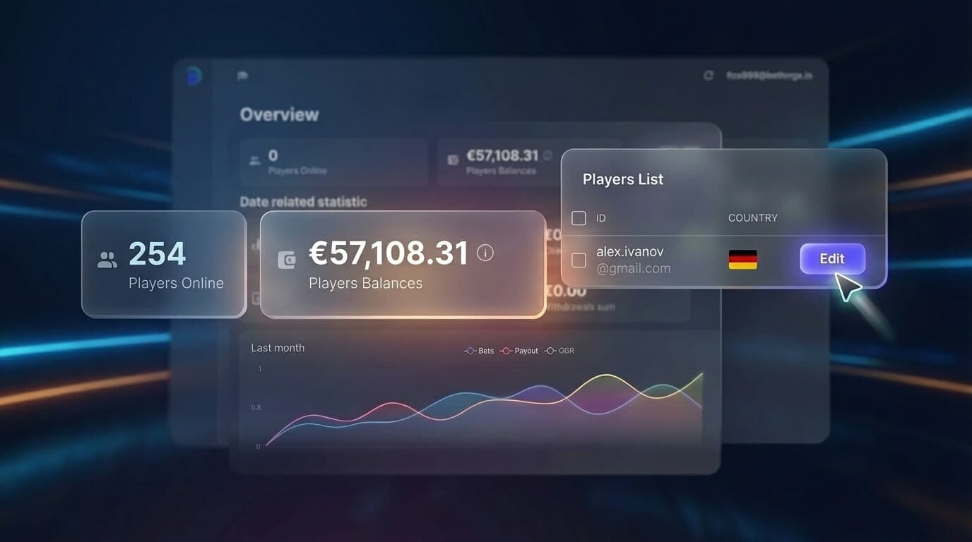
Our back-office is the product
At BetForge, we realized we have to treat our admin panel with the exact same scrutiny as a player-facing feature. Because for our operators, it is the product. It’s what they interact with daily, and it’s exactly what we show in every single sales demo.
As for that 'Edit' button? We went with the hover behavior to keep things clean, but added a subtle visual cue that actions exist on the row. A tiny compromise, but it represented a shift in how we build.
The iGaming operators who pull ahead in the coming years aren't just going to be the ones with the cheapest player acquisition. They'll be the ones whose internal teams can move fast, spot data trends without getting a headache, and scale without breaking. A decent back-office isn't a luxury anymore - it's how you get there.